Histogram is quick way to analyze exposure in photography. It helps us to understand how much details each image has preserved. Pixel details should not loose because of dark shadows or due to too much highlight in photograph. In this article we will be Understanding Histogram : How to Use Histogram to get correct Exposure with example.
Understanding Histogram :
Understanding Histogram can be found in almost every camera and image editing software. Some camera allows a live view as well if you shoot through LCD. Histogram has become very important and helpful to understand in how much details each part of image carries. Understanding Histogram can be difficult to read in start, I agree it looks very complicated with up n down vertical bars but believe me its very easy to understand and quite helpful too. Here in this blog we will try Understanding Histograms Statistics in Photography.
A histogram is a graphical representation of the tonal values of your image. In other words, it shows the amount of tones of particular brightness found in your photograph ranging from black (0% brightness) to white (100% brightness). The middle portion of the histogram represents mid-tones, which are neither dark nor light. Vertical axis of a histogram displays the amount of tones of that particular lightness.
Understanding Histograms in Photography :
The left side of the graph represents the blacks or shadows, the right side represents the highlights or bright areas and the middle section is mid-tones. How high the peaks reach represent the number of pixels in that particular tone. Each tone from 0-255 (o being black and 255 being white) is one pixel wide on the graph, so imagine the histogram as a bar graph all squished together with no spaces between each bar.
How to Use Histogram to get correct Exposure
Now let’s see, How to Use Histogram to get correct Exposure.
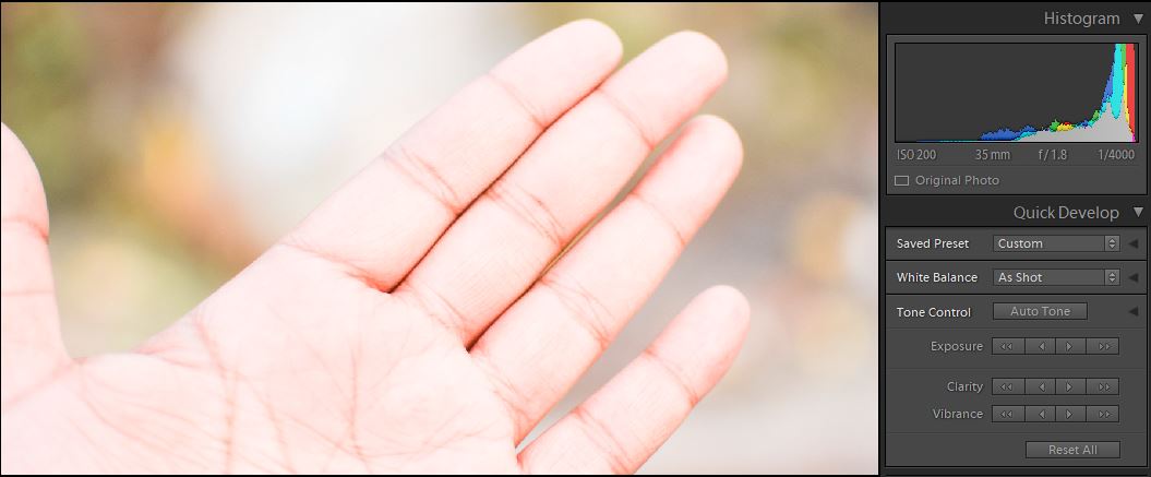
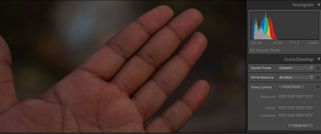
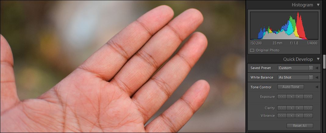
There’s no such thing as a “perfect” histogram graph. The histogram’s shape is determined by the distribution of light among the complete picture, while the histogram’s left/right position is a function of the amount of exposure given the image. The amount of exposure you give an image is an individual choice, but in general, photographers try to avoid clipping ( loss of details due to over or under exposure) the histogram’s graph on the fat left or the far right.


Shadow and Highlight sides in Histogram :
Gaps on either end indicates you are missing information and your exposure can be shifted safely without losing detail. If its touching to the left side of graph, it indicates pictures in underexposed and on the right side it says picture is overexposed. Both can be fixed by altering exposure setting.
You also have to remember, if there is a sun in your image then obviously it would be very bright and white and in this part of the image due to this highlight you could loose some details around this portion of image.
Histogram graph which primarily displays three colors – RGB ( Red, Green, Blue ) and can be called as RGB histogram. You can notice that it consists of several diagrams marked with different colors. Three of these diagrams represent red, green and blue color channels accordingly. Gray diagram shows where all three channels overlap. Yellow, cyan and magenta appear where two of the channels overlap.
Conclusion :
Many photographers makes a good habit of seeing histogram after click just to make sure nothing on the extreme right or left. Well, this habit is not going to make you a good photographer and you should also have enough time to look through LCD and analyze histogram. However, you should know how to read histogram which is helpful and invaluable in some situation at times.
Hopefully, this article helped you to understand what histograms is all about and how to read it.
Did you enjoy this article? Please share it! 🙂